
The Claude plugin is here
Accessible color palettes — generated in seconds, mastered with precision, deployed everywhere.
Add plugin
Start a palette


Generate it
Create palettes in minutes with AI, images, color wheel, canvas, or 1M+ imported combinations.


Manage it
Control every shade against WCAG & APCA. Filter, simulate color-blind vision, build light/dark modes.


Deploy it
Push to styles, variables, and tokens. Export Tailwind, CSS, and W3C Design Tokens — ready for production.
See the capabilities


Shape every shade until it's accessible and just right.


Claude
On Claude nine →


Framer
Frame it up →

Sketch
Sketch it out →


Penpot
Sweeten the pot →

Figma
Figure it out →
Optional add-ons to bring UI Color Palette into the assistant you already work with.

Everything you need to know about color, accessibility, and how UI Color Palette works.
OKLCH or HSL — why does it matter?


HSL is familiar, but it's perceptually uneven: the same lightness looks brighter for yellow than for blue, so scales drift. OKLCH is perceptually uniform — equal steps look equal to the eye, so your shades stay consistent and your contrast holds up. You can still work in HEX, RGB, or HSL and switch color spaces (OKLCH, OKLAB, HSLuv…) whenever you like.
WCAG 2.1 or WCAG 3 (APCA)?
WCAG 2.1 gives the contrast ratios (AA/AAA) you need for compliance today. APCA — from the emerging WCAG 3 — models how we actually perceive contrast, and is far more accurate for dark mode and thin text. UI Color Palette shows both on every stop, so you meet today's standard while designing for tomorrow's.
Can I reuse one palette across platforms?
Yes! Publish once to the cloud, then pull the same palette into Figma, Penpot, Sketch, and Framer. Update it in one place and sync everywhere — your color stays consistent wherever your team works.
What are primitive colors?
Creating a palette goes well beyond picking a few source colors. Each source color is scaled into a full range of stops — and those stops are your primitives (like blue-100 → blue-1000): raw, literal colors named by hue and step, with no meaning attached yet. They're the foundation you then map into semantics, giving each color a role.
And what about semantic colors?
Semantics map primitives to intent — color-action, color-danger, color-surface. Instead of hardcoding blue-500, you reference the role. Swap the primitive underneath and every semantic token updates, which makes theming and light/dark modes effortless.
Is there a free plan?
Yes! The /basic plan is free forever — 3 palettes per document, 5 source colors, 6 stops, 2 color modes, and CSS export. Upgrade to /pro for unlimited everything and full code export whenever you're ready. See Pricing.
What should I do if I'm stuck and need help?
Send an email to hello@ui-color-palette.com with clear steps to reproduce and any relevant screenshots, and we'll help you out.
How can I give feedback or suggest a new feature?
We'd love to hear from you! Use our feedback form or submit ideas on our feature request platform.
It's open-source — can I contribute?
Absolutely. UI Color Palette is open-source, so you're welcome to explore the code, open issues, and submit pull requests on GitHub. Community fixes and feature ideas are what keep it getting better.

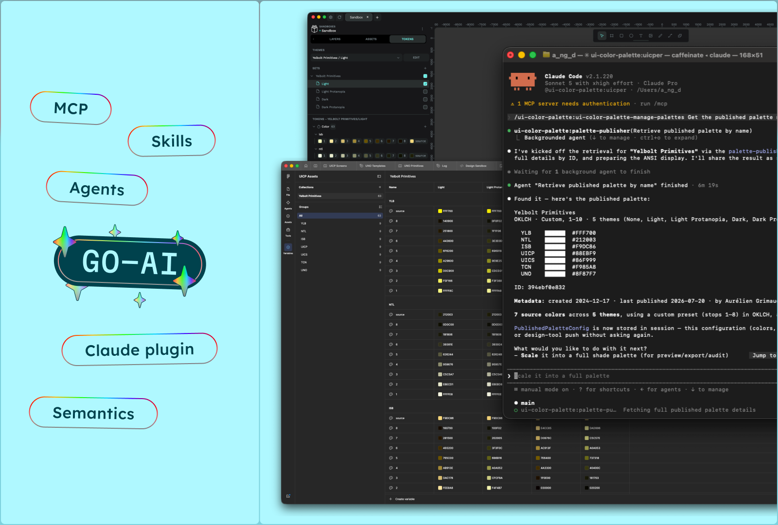
3 ways AI now builds, audits, and deploys your color systems
Your AI agent can now create palettes, audit contrast, and ship color systems to Figma, Penpot, or your codebase — here are the 3 workflows to try today.
Read more

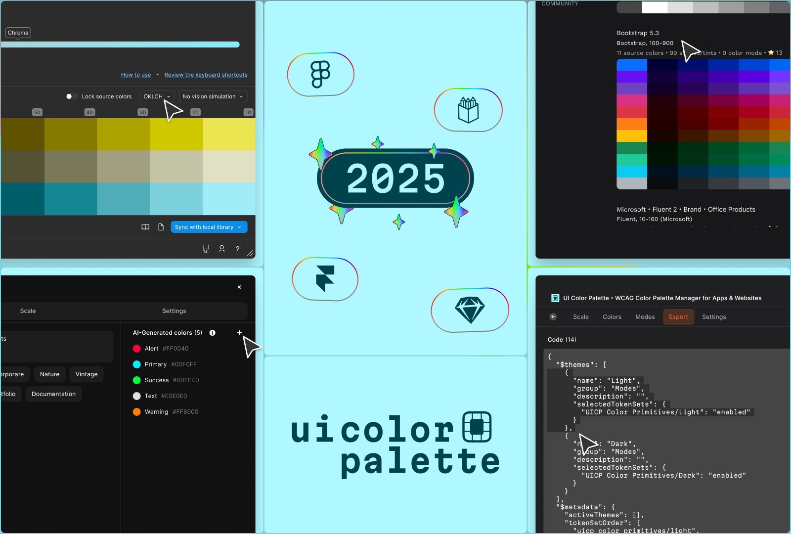
Goodbye 2025 plugin and welcome to 2026 app
2025 was a pivotal year for UI Color Palette. What started as a simple Figma plugin has transformed into a cross-platform mini-app.
Read more
Shape every shade until it's accessible and just right.

The Claude plugin is here
Accessible color palettes — generated in seconds, mastered with precision, deployed everywhere.
Add plugin
Start a palette
Generate it
Create palettes in minutes with AI, images, color wheel, canvas, or 1M+ imported combinations.
See the capabilities
Manage it
Control every shade against WCAG & APCA. Filter, simulate color-blind vision, build light/dark modes.
Deploy it
Push to styles, variables, and tokens. Export Tailwind, CSS, and W3C Design Tokens — ready for production.
Shape every shade until it's accessible and just right.
Shape every shade until it's accessible and just right.

Claude
On Claude nine →
Framer
Frame it up →
Sketch
Sketch it out →
Penpot
Sweeten the pot →

Figma
Figure it out →
Optional add-ons to bring UI Color Palette into the assistant you already work with.
MCP server
Drive UI Color Palette from the LLM of your choice. Plug it in →

Skills
Open-source instructions that teach any AI the method. Skill up →
/skills
Everything you need to know about color, accessibility, and how UI Color Palette works.
OKLCH or HSL — why does it matter?
HSL is familiar, but it's perceptually uneven: the same lightness looks brighter for yellow than for blue, so scales drift. OKLCH is perceptually uniform — equal steps look equal to the eye, so your shades stay consistent and your contrast holds up. You can still work in HEX, RGB, or HSL and switch color spaces (OKLCH, OKLAB, HSLuv…) whenever you like.
WCAG 2.1 or WCAG 3 (APCA)?
WCAG 2.1 gives the contrast ratios (AA/AAA) you need for compliance today. APCA — from the emerging WCAG 3 — models how we actually perceive contrast, and is far more accurate for dark mode and thin text. UI Color Palette shows both on every stop, so you meet today's standard while designing for tomorrow's.
Can I reuse one palette across platforms?
Yes! Publish once to the cloud, then pull the same palette into Figma, Penpot, Sketch, and Framer. Update it in one place and sync everywhere — your color stays consistent wherever your team works.
What are primitive colors?
Creating a palette goes well beyond picking a few source colors. Each source color is scaled into a full range of stops — and those stops are your primitives (like blue-100 → blue-1000): raw, literal colors named by hue and step, with no meaning attached yet. They're the foundation you then map into semantics, giving each color a role.
And what about semantic colors?
Semantics map primitives to intent — color-action, color-danger, color-surface. Instead of hardcoding blue-500, you reference the role. Swap the primitive underneath and every semantic token updates, which makes theming and light/dark modes effortless.
Is there a free plan?
Yes! The /basic plan is free forever — 3 palettes per document, 5 source colors, 6 stops, 2 color modes, and CSS export. Upgrade to /pro for unlimited everything and full code export whenever you're ready. See Pricing.
What should I do if I'm stuck and need help?
Send an email to hello@ui-color-palette.com with clear steps to reproduce and any relevant screenshots, and we'll help you out.
How can I give feedback or suggest a new feature?
We'd love to hear from you! Use our feedback form or submit ideas on our feature request platform.
It's open-source — can I contribute?
Absolutely. UI Color Palette is open-source, so you're welcome to explore the code, open issues, and submit pull requests on GitHub. Community fixes and feature ideas are what keep it getting better.
3 ways AI now builds, audits, and deploys your color systems
Your AI agent can now create palettes, audit contrast, and ship color systems to Figma, Penpot, or your codebase — here are the 3 workflows to try today.
Read more
Goodbye 2025 plugin and welcome to 2026 app
2025 was a pivotal year for UI Color Palette. What started as a simple Figma plugin has transformed into a cross-platform mini-app.
Read more
Shape every shade until it's accessible and just right.


The Claude plugin is here
Accessible color palettes — generated in seconds, mastered with precision, deployed everywhere.
Add plugin
Start a palette
Generate it
Create palettes in minutes with AI, images, color wheel, canvas, or 1M+ imported combinations.
Manage it
Control every shade against WCAG & APCA. Filter, simulate color-blind vision, build light/dark modes.
Deploy it
Push to styles, variables, and tokens. Export Tailwind, CSS, and W3C Design Tokens — ready for production.
See the capabilities
Shape every shade until it's accessible and just right.

Claude
On Claude nine →
Framer
Frame it up →
Sketch
Sketch it out →
Penpot
Sweeten the pot →
Figma
Figure it out →
MCP server
Drive UI Color Palette from the LLM of your choice. Plug it in →

Skills
Open-source instructions that teach any AI the method. Skill up →
/skills
Optional add-ons to bring UI Color Palette into the assistant you already work with.
Everything you need to know about color, accessibility, and how UI Color Palette works.
OKLCH or HSL — why does it matter?
HSL is familiar, but it's perceptually uneven: the same lightness looks brighter for yellow than for blue, so scales drift. OKLCH is perceptually uniform — equal steps look equal to the eye, so your shades stay consistent and your contrast holds up. You can still work in HEX, RGB, or HSL and switch color spaces (OKLCH, OKLAB, HSLuv…) whenever you like.
WCAG 2.1 or WCAG 3 (APCA)?
WCAG 2.1 gives the contrast ratios (AA/AAA) you need for compliance today. APCA — from the emerging WCAG 3 — models how we actually perceive contrast, and is far more accurate for dark mode and thin text. UI Color Palette shows both on every stop, so you meet today's standard while designing for tomorrow's.
Can I reuse one palette across platforms?
Yes! Publish once to the cloud, then pull the same palette into Figma, Penpot, Sketch, and Framer. Update it in one place and sync everywhere — your color stays consistent wherever your team works.
What are primitive colors?
Creating a palette goes well beyond picking a few source colors. Each source color is scaled into a full range of stops — and those stops are your primitives (like blue-100 → blue-1000): raw, literal colors named by hue and step, with no meaning attached yet. They're the foundation you then map into semantics, giving each color a role.
And what about semantic colors?
Semantics map primitives to intent — color-action, color-danger, color-surface. Instead of hardcoding blue-500, you reference the role. Swap the primitive underneath and every semantic token updates, which makes theming and light/dark modes effortless.
Is there a free plan?
Yes! The /basic plan is free forever — 3 palettes per document, 5 source colors, 6 stops, 2 color modes, and CSS export. Upgrade to /pro for unlimited everything and full code export whenever you're ready. See Pricing.
What should I do if I'm stuck and need help?
Send an email to hello@ui-color-palette.com with clear steps to reproduce and any relevant screenshots, and we'll help you out.
How can I give feedback or suggest a new feature?
We'd love to hear from you! Use our feedback form or submit ideas on our feature request platform.
It's open-source — can I contribute?
Absolutely. UI Color Palette is open-source, so you're welcome to explore the code, open issues, and submit pull requests on GitHub. Community fixes and feature ideas are what keep it getting better.
3 ways AI now builds, audits, and deploys your color systems
Your AI agent can now create palettes, audit contrast, and ship color systems to Figma, Penpot, or your codebase — here are the 3 workflows to try today.
Read more
Goodbye 2025 plugin and welcome to 2026 app
2025 was a pivotal year for UI Color Palette. What started as a simple Figma plugin has transformed into a cross-platform mini-app.
Read more
News

The Claude plugin is here
Accessible color palettes — generated in seconds, mastered with precision, deployed everywhere.
Add plugin
Start a palette
Generate it
Create palettes in minutes with AI, images, color wheel, canvas, or 1M+ imported combinations.
Master it
Control every shade against WCAG & APCA. Filter, simulate color-blind vision, build light/dark modes.
Deploy it
Push to styles, variables, and tokens. Export Tailwind, CSS, and W3C Design Tokens — ready for production.
See the capabilities
Shape every shade until it's accessible and just right.

Claude
On Claude nine →
Framer
Frame it up →
Sketch
Sketch it out →
Penpot
Sweeten the pot →

Figma
Figure it out →
MCP server
Drive UI Color Palette from the LLM of your choice. Plug it in →

Skills
Open-source instructions that teach any AI the method. Skill up →
/skills
Optional add-ons to bring UI Color Palette into the assistant you already work with.
Everything you need to know about color, accessibility, and how UI Color Palette works.
OKLCH or HSL — why does it matter?
HSL is familiar, but it's perceptually uneven: the same lightness looks brighter for yellow than for blue, so scales drift. OKLCH is perceptually uniform — equal steps look equal to the eye, so your shades stay consistent and your contrast holds up. You can still work in HEX, RGB, or HSL and switch color spaces (OKLCH, OKLAB, HSLuv…) whenever you like.
WCAG 2.1 or WCAG 3 (APCA)?
WCAG 2.1 gives the contrast ratios (AA/AAA) you need for compliance today. APCA — from the emerging WCAG 3 — models how we actually perceive contrast, and is far more accurate for dark mode and thin text. UI Color Palette shows both on every stop, so you meet today's standard while designing for tomorrow's.
Can I reuse one palette across platforms?
Yes! Publish once to the cloud, then pull the same palette into Figma, Penpot, Sketch, and Framer. Update it in one place and sync everywhere — your color stays consistent wherever your team works.
What are primitive colors?
Creating a palette goes well beyond picking a few source colors. Each source color is scaled into a full range of stops — and those stops are your primitives (like blue-100 → blue-1000): raw, literal colors named by hue and step, with no meaning attached yet. They're the foundation you then map into semantics, giving each color a role.
And what about semantic colors?
Semantics map primitives to intent — color-action, color-danger, color-surface. Instead of hardcoding blue-500, you reference the role. Swap the primitive underneath and every semantic token updates, which makes theming and light/dark modes effortless.
Is there a free plan?
Yes! The /basic plan is free forever — 3 palettes per document, 5 source colors, 6 stops, 2 color modes, and CSS export. Upgrade to /pro for unlimited everything and full code export whenever you're ready. See Pricing.
What should I do if I'm stuck and need help?
Send an email to hello@ui-color-palette.com with clear steps to reproduce and any relevant screenshots, and we'll help you out.
How can I give feedback or suggest a new feature?
We'd love to hear from you! Use our feedback form or submit ideas on our feature request platform.
It's open-source — can I contribute?
Absolutely. UI Color Palette is open-source, so you're welcome to explore the code, open issues, and submit pull requests on GitHub. Community fixes and feature ideas are what keep it getting better.
3 ways AI now builds, audits, and deploys your color systems
Your AI agent can now create palettes, audit contrast, and ship color systems to Figma, Penpot, or your codebase — here are the 3 workflows to try today.
Read more
Goodbye 2025 plugin and welcome to 2026 app
2025 was a pivotal year for UI Color Palette. What started as a simple Figma plugin has transformed into a cross-platform mini-app.
Read more
News