
Shared across Figma, Penpot, Sketch, and Framer.
Spin up a full color palette in seconds — your way.
Ready from the very first second
You never start empty. UI Color Palette opens with a palette already generated — 5 source colors across 6 steps, for 30 ready-to-edit shades. Keep them, reroll them, or reshape everything with the tools below.

Sources
80
70
60
50
40
30
20
10
Primary
Neutral
UICP
WCAG Δ

0.3
0.01
0.61
0.04
0.83
0.1
0.43
0.14
0.15
0.16
0.06
0.19
0.01
0.25
0.02
0.14
AI generation
Describe the mood you're after and let AI generate 5 source colors from a single prompt.

Cyberpunk futuristic interface with neon accents
Cyberpunk
Minimalist
Pastel
Corporate
Nature
Vintage
Landing page
Blog
Resume
Portfolio
Generate documentation
E-commerce
Generate colors (⌃⏎ or ⌘⏎)


Image extraction
Drop in an image and pull its main colors straight into your palette.


I_am_a_poor_lonesome_cowboy.png


Color wheel
Pick and fine-tune your source colors by hand, directly on the color wheel.
Base color
88EBF9
Color wheel
Tetradic

F99688
Mona Lisa
CE88F9
Pale Violet
88EBF9
Spreay
B2F988
Sulu
Explore & import
Browse millions and millions of community-shared palettes and import the one that clicks.

Giant Goldfish
Custom, 1-10
manekineko


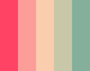
(???)
Custom, 1-10
sugar!
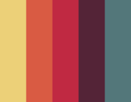
Thought Provoking
Custom, 1-10
mk2

cheer up emo kid
Custom, 1-10
electrikmonk
Load more palettes
Fine-tune every stop
Dial in lightness, chroma, and hue with precision to shape a scale that feels exactly right.

Custom, 10-100
80
70
60
50
40
30
20
10

Chroma

Hue
Light, Dark, and beyond
Build unlimited color modes — light, dark, and color-blind simulations — with custom foreground colors for tailored ratios.

Color modes
(2)
Light


Dark


Contrast mastering
Real-time WCAG 2.1 and APCA scores on every stop, so you always land the contrast ratio you're after.
UICP 20


Section title
Light foreground color
Dark foreground color
The quick brown fox jumps over the lazy dog.

WCAG 2.1 score
1.37
A
Fail
APCA score
Lc 20.6
Non-text
Fail
Readability score
19%
Minimum font size
777pt (400)
The quick brown fox jumps over the lazy dog.
Custom, 10-100


80
70
60
50
40
30
20
10

Chroma

Hue
Ease in
Sine


Shape every shade until it's accessible and just right.
Share with the community
Publish palettes for other makers and get inspired in return — Adobe Spectrum, Microsoft Fluent, and more, ready to reuse.
Search palettes…

Adobe・Spectrum 6.0.0・Neutral
Spectrum, Neutral 25-900 (Adobe)
1 source color
・
11 shades/tints
・
2 color modes
Bootstrap 5.3
Bootstrap, 100-900
11 source colors
・
104 shades/tints
・
No color mode
Microsoft・Fluent 2・Brand・Office Products
Fluent, 10-160 (Microsoft)
5 source colors
・
75 shades/tints
・
No color mode
Add to local
Load more palettes
Publish & reuse anywhere
Publish your palettes to the cloud, then push and pull them across every environment — Figma, Penpot, Sketch, and Framer.
Search palettes…
UICP Color Primitives
Shared
Custom, 1-10
3 source colors
・
64 shades/tints
・
2 color modes

The palettes list is complete
Grab your tokens & config
Retrieve W3C (DTCG) design tokens, Tokens Studio, Style Dictionary, and ready-to-ship Tailwind V3 & V4 configs.
Tailwind v4 (CSS)

@import "tailwindcss";@theme { --color-*: initial; /* Light - Primary */ --color-light-primary-source: #fff700; --color-light-primary-80: #0b0100; --color-light-primary-70: #240d00; --color-light-primary-60: #452900; --color-light-primary-50: #6a4d00; --color-light-primary-40: #937500; --color-light-primary-30: #b99e00; --color-light-primary-20: #dbc400; --color-light-primary-10: #f6e127; /* Light - Neutral */ --color-light-neutral-source: #212003; --color-light-neutral-80: #050300; --color-light-neutral-70: #171401; --color-light-neutral-60: #333013; --color-light-neutral-50: #555231; --color-light-neutral-40: #7c7856;
Sync with your team
Create and update local styles and variables so your palette stays in sync with your team's library.


Synchronize…

Sources
80
70
60
50
40
30
20
10
Primary
Neutral
UICP
WCAG Δ
0.3
0.01
0.61
0.04
0.83
0.1
0.43
0.14
0.15
0.16
0.06
0.19
0.01
0.25
0.02
0.14


Light
Sync with local styles
Sync with local variables
Take your palette everywhere it needs to go.
Readability playground
Preview real text on any stop and read its live readability score, WCAG & APCA grade, and minimum font size.
Colors in outer Spaces
Change the color space for perfect brightness and consistency — OKLCH, OKLAB, HSLuv, etc.
Ultra Handoff
Export your palettes in several formats to bootstrap your project for web, mobile—Apple SwiftUI, Android Compose, etc…
Simulations that empathize
Translate your color scale into different forms of color-blind vision — Red-weak, blue-weak, total blindness, etc.
Best-in-class presets
Scale your colors from existing color systems — Google Material, Tailwind, Ant Design, etc.
The details that make UI Color Palette best-in-class.
Developers
You want production-ready tokens and configurations, not a PNG screenshot of a palette.

Tailwind V3 & V4 configs — copy-paste CSS custom properties
W3C Design Tokens (DTCG) — standardized JSON for any token pipeline
CSS / SCSS export — ready for production
Designers
You need accessible, consistent palettes that integrate seamlessly into your design workflow.
AI-powered color generation — from themes like Cyberpunk, Minimalist, Corporate, etc.
WCAG & APCA contrast checks — accessibility built into every shade
Native integration — sync styles and variables on Figma, Penpot, Sketch, and Framer
Whether you're crafting a design system or shipping a side project — UI Color Palette meets you where you are.

Shared across Figma, Penpot, Sketch, and Framer.
Spin up a full color palette in seconds — your way.
Ready from the very first second
You never start empty. UI Color Palette opens with a palette already generated — 5 source colors across 6 steps, for 30 ready-to-edit shades. Keep them, reroll them, or reshape everything with the tools below.

Sources
80
70
60
50
40
30
20
10
Primary
Neutral
UICP
WCAG Δ
0.3
0.01
0.61
0.04
0.83
0.1
0.43
0.14
0.15
0.16
0.06
0.19
0.01
0.25
0.02
0.14
AI generation
Describe the mood you're after and let AI generate 5 source colors from a single prompt.

Cyberpunk futuristic interface with neon accents
Cyberpunk
Minimalist
Pastel
Corporate
Nature
Vintage
Landing page
Blog
Resume
Portfolio
Generate documentation
E-commerce
Generate colors (⌃⏎ or ⌘⏎)
AI-Generated colors
(5)
Alert
#FF0040
Primary
#00F0FF
Success
#00FF40
Text
#E0E0E0
Warning
#FF8000

Image extraction
Drop in an image and pull its main colors straight into your palette.

I_am_a_poor_lonesome_cowboy.png
AI-Generated colors
(5)
Wine Dregs
#653342
Tapestry
#A96383
Japonica
#ED856C
Jaguar
#1F0A18
Can Can
#DA99AE
Color wheel
Pick and fine-tune your source colors by hand, directly on the color wheel.
Base color
88EBF9
Color wheel
Tetradic
・
F99688
Mona Lisa
CE88F9
Pale Violet
88EBF9
Spreay
B2F988
Sulu
Explore & import
Browse millions and millions of community-shared palettes and import the one that clicks.
Giant Goldfish
Custom, 1-10
23545 votes・504345 views・3452 comments
manekineko
(???)
Custom, 1-10
23545 votes・504345 views・3452 comments
sugar!
Thought Provoking
Custom, 1-10
23545 votes・504345 views・3452 comments
mk2
cheer up emo kid
Custom, 1-10
23545 votes・504345 views・3452 comments
electrikmonk
Load more palettes
Fine-tune every stop
Dial in lightness, chroma, and hue with precision to shape a scale that feels exactly right.
Sources
80
70
60
50
40
30
20
10
Primary
Lc
107.9
✓
Lc
0.0
✗
Lc
107.1
✓
Lc
0.0
✗
Lc
102.7
✓
Lc
0.0
✗
Lc
91.7
✓
Lc
17.1
✗
Lc
75.3
✓
Lc
34.3
✗
Lc
56.2
✓
Lc
53.0
✓
Lc
36.0
✗
Lc
71.8
✓
Lc
18.4
✗
Lc
87.6
✓
Neutral
Lc
107.9
✓
Lc
0.0
✗
Lc
107.1
✓
Lc
0.0
✗
Lc
103.0
✓
Lc
0.0
✗
Lc
92.4
✓
Lc
0.0
✗
Lc
76.5
✓
Lc
33.0
✗
Lc
57.3
✓
Lc
51.9
✓
Lc
37.0
✗
Lc
70.9
✓
Lc
19.4
✗
Lc
86.7
✓
UICP
Lc
107.8
✓
Lc
0.0
✗
Lc
106.6
✓
Lc
0.0
✗
Lc
101.6
✓
Lc
0.0
✗
Lc
90.6
✓
Lc
18.2
✗
Lc
74.9
✓
Lc
34.6
✗
Lc
56.0
✓
Lc
53.2
✓
Lc
35.6
✗
Lc
72.1
✓
Lc
17.8
✗
Lc
88.1
✗
WCAG Δ
0.3
0.01
0.61
0.04
0.83
0.1
0.43
0.14
0.15
0.16
0.06
0.19
0.01
0.25
0.02
0.14
Light
Color scale
(8)
Contrast mode
Custom, 10-100
80
70
60
50
40
30
20
10

Chroma

Hue
Ease in
Sine
Light, Dark, and beyond
Build unlimited color modes — light, dark, and color-blind simulations — with custom foreground colors for tailored ratios.
Sources
80
70
60
50
40
30
20
10
Primary
Neutral
UICP
WCAG Δ
0.3
0.01
0.61
0.04
0.83
0.1
0.43
0.14
0.15
0.16
0.06
0.19
0.01
0.25
0.02
0.14
Light
Color modes
(2)
Light
Dark
Contrast mastering
Real-time WCAG 2.1 and APCA scores on every stop, so you always land the contrast ratio you're after.
Sources
80
70
60
50
40
30
20
10
Primary
Lc
107.9
✓
Lc
0.0
✗
Lc
107.1
✓
Lc
0.0
✗
Lc
102.7
✓
Lc
0.0
✗
Lc
91.7
✓
Lc
17.1
✗
Lc
75.3
✓
Lc
34.3
✗
Lc
56.2
✓
Lc
53.0
✓
Lc
36.0
✗
Lc
71.8
✓
Lc
18.4
✗
Lc
87.6
✓
Neutral
Lc
107.9
✓
Lc
0.0
✗
Lc
107.1
✓
Lc
0.0
✗
Lc
103.0
✓
Lc
0.0
✗
Lc
92.4
✓
Lc
0.0
✗
Lc
76.5
✓
Lc
33.0
✗
Lc
57.3
✓
Lc
51.9
✓
Lc
37.0
✗
Lc
70.9
✓
Lc
19.4
✗
Lc
86.7
✓
UICP
Lc
107.8
✓
Lc
0.0
✗
Lc
106.6
✓
Lc
0.0
✗
Lc
101.6
✓
Lc
0.0
✗
Lc
90.6
✓
Lc
18.2
✗
Lc
74.9
✓
Lc
34.6
✗
Lc
56.0
✓
Lc
53.2
✓
Lc
35.6
✗
Lc
72.1
✓
Lc
17.8
✗
Lc
88.1
✗
WCAG Δ
0.3
0.01
0.61
0.04
0.83
0.1
0.43
0.14
0.15
0.16
0.06
0.19
0.01
0.25
0.02
0.14
Light
UICP 20
Contrast details
Light foreground color
Dark foreground color
The quick brown fox jumps over the lazy dog.
WCAG 2.1 score
1.37
A
Fail
APCA score
Lc 20.6
Non-text
Fail
Readability score
19%
Minimum font size
777pt (400)
The quick brown fox jumps over the lazy dog.
Custom, 10-100
80
70
60
50
40
30
20
10
Chroma
Hue
Ease in
Sine
Shape every shade until it's accessible and just right.
Share with the community
Publish palettes for other makers and get inspired in return — Adobe Spectrum, Microsoft Fluent, and more, ready to reuse.


My palettes
Starred
Organization
Community
Search palettes…
Adobe・Spectrum 6.0.0・Neutral
Spectrum, Neutral 25-900 (Adobe)
1 source color
・
11 shades/tints
・
2 color modes
Add to local
Bootstrap 5.3
Bootstrap, 100-900
11 source colors
・
104 shades/tints
・
No color mode
Add to local
Microsoft・Fluent 2・Brand・Office Products
Fluent, 10-160 (Microsoft)
5 source colors
・
75 shades/tints
・
No color mode
Add to local
Load more palettes
Publish & reuse anywhere
Publish your palettes to the cloud, then push and pull them across every environment — Figma, Penpot, Sketch, and Framer.

My palettes
Starred
Organization
Community
Search palettes…
UICP Color Primitives
Shared
Custom, 1-10
3 source colors
・
64 shades/tints
・
2 color modes
Add to local
The palettes list is complete
Grab your tokens & config
Retrieve W3C (DTCG) design tokens, Tokens Studio, Style Dictionary, and ready-to-ship Tailwind V3 & V4 configs.
Code
(14)
Tailwind v4 (CSS)

@import "tailwindcss";@theme { --color-*: initial; /* Light - Primary */ --color-light-primary-source: #fff700; --color-light-primary-80: #0b0100; --color-light-primary-70: #240d00; --color-light-primary-60: #452900; --color-light-primary-50: #6a4d00; --color-light-primary-40: #937500; --color-light-primary-30: #b99e00; --color-light-primary-20: #dbc400; --color-light-primary-10: #f6e127; /* Light - Neutral */ --color-light-neutral-source: #212003; --color-light-neutral-80: #050300; --color-light-neutral-70: #171401; --color-light-neutral-60: #333013; --color-light-neutral-50: #555231; --color-light-neutral-40: #7c7856;
Sync with your team
Create and update local styles and variables so your palette stays in sync with your team's library.

UICP Color Primitives
Published
Synchronize…
Sources
80
70
60
50
40
30
20
10
Primary
Neutral
UICP
WCAG Δ
0.3
0.01
0.61
0.04
0.83
0.1
0.43
0.14
0.15
0.16
0.06
0.19
0.01
0.25
0.02
0.14
Light
Sync with local styles
Sync with local variables
Take your palette everywhere it needs to go.
Readability playground
Preview real text on any stop and read its live readability score, WCAG & APCA grade, and minimum font size.
Colors in outer Spaces
Change the color space for perfect brightness and consistency — OKLCH, OKLAB, HSLuv, etc.
Ultra Handoff
Export your palettes in several formats to bootstrap your project for web, mobile—Apple SwiftUI, Android Compose, etc…
Best-in-class presets
Scale your colors from existing color systems — Google Material, Tailwind, Ant Design, etc.
Simulations that empathize
Translate your color scale into different forms of color-blind vision — Red-weak, blue-weak, total blindness, etc.
The details that make UI Color Palette best-in-class.
Developers
You want production-ready tokens and configurations, not a PNG screenshot of a palette.
Tailwind V3 & V4 configs — copy-paste CSS custom properties
W3C Design Tokens (DTCG) — standardized JSON for any token pipeline
CSS / SCSS export — ready for production
Designers
You need accessible, consistent palettes that integrate seamlessly into your design workflow.
AI-powered color generation — from themes like Cyberpunk, Minimalist, Corporate, etc.
WCAG & APCA contrast checks — accessibility built into every shade
Native integration — sync styles and variables on Figma, Penpot, Sketch, and Framer
Whether you're crafting a design system or shipping a side project — UI Color Palette meets you where you are.

Shared across Figma, Penpot, Sketch, and Framer.
Spin up a full color palette in seconds — your way.
Ready from the very first second
You never start empty. UI Color Palette opens with a palette already generated — 5 source colors across 6 steps, for 30 ready-to-edit shades. Keep them, reroll them, or reshape everything with the tools below.

Sources
80
70
60
50
40
30
20
10
Primary
Neutral
UICP
WCAG Δ
0.3
0.01
0.61
0.04
0.83
0.1
0.43
0.14
0.15
0.16
0.06
0.19
0.01
0.25
0.02
0.14
AI generation
Describe the mood you're after and let AI generate 5 source colors from a single prompt.

Cyberpunk futuristic interface with neon accents
Cyberpunk
Minimalist
Pastel
Corporate
Nature
Vintage
Landing page
Blog
Resume
Portfolio
Generate documentation
E-commerce
Generate colors (⌃⏎ or ⌘⏎)
AI-Generated colors
(5)
Alert
#FF0040
Primary
#00F0FF
Success
#00FF40
Text
#E0E0E0
Warning
#FF8000
Image extraction
Drop in an image and pull its main colors straight into your palette.

I_am_a_poor_lonesome_cowboy.png
AI-Generated colors
(5)
Wine Dregs
#653342
Tapestry
#A96383
Japonica
#ED856C
Jaguar
#1F0A18
Can Can
#DA99AE
Color wheel
Pick and fine-tune your source colors by hand, directly on the color wheel.
Base color
88EBF9
Color wheel
Tetradic
・
F99688
Mona Lisa
CE88F9
Pale Violet
88EBF9
Spreay
B2F988
Sulu
Explore & import
Browse millions and millions of community-shared palettes and import the one that clicks.
Giant Goldfish
Custom, 1-10
23545 votes・504345 views・3452 comments
manekineko
(???)
Custom, 1-10
23545 votes・504345 views・3452 comments
sugar!
Thought Provoking
Custom, 1-10
23545 votes・504345 views・3452 comments
mk2
cheer up emo kid
Custom, 1-10
23545 votes・504345 views・3452 comments
electrikmonk
Load more palettes
Fine-tune every stop
Dial in lightness, chroma, and hue with precision to shape a scale that feels exactly right.

Sources
80
70
60
50
40
30
20
10
Primary
Lc
107.9
✓
Lc
0.0
✗
Lc
107.1
✓
Lc
0.0
✗
Lc
102.7
✓
Lc
0.0
✗
Lc
91.7
✓
Lc
17.1
✗
Lc
75.3
✓
Lc
34.3
✗
Lc
56.2
✓
Lc
53.0
✓
Lc
36.0
✗
Lc
71.8
✓
Lc
18.4
✗
Lc
87.6
✓
Neutral
Lc
107.9
✓
Lc
0.0
✗
Lc
107.1
✓
Lc
0.0
✗
Lc
103.0
✓
Lc
0.0
✗
Lc
92.4
✓
Lc
0.0
✗
Lc
76.5
✓
Lc
33.0
✗
Lc
57.3
✓
Lc
51.9
✓
Lc
37.0
✗
Lc
70.9
✓
Lc
19.4
✗
Lc
86.7
✓
UICP
Lc
107.8
✓
Lc
0.0
✗
Lc
106.6
✓
Lc
0.0
✗
Lc
101.6
✓
Lc
0.0
✗
Lc
90.6
✓
Lc
18.2
✗
Lc
74.9
✓
Lc
34.6
✗
Lc
56.0
✓
Lc
53.2
✓
Lc
35.6
✗
Lc
72.1
✓
Lc
17.8
✗
Lc
88.1
✗
WCAG Δ
0.3
0.01
0.61
0.04
0.83
0.1
0.43
0.14
0.15
0.16
0.06
0.19
0.01
0.25
0.02
0.14
Light
Color scale
(8)
Contrast mode
Custom, 10-100
80
70
60
50
40
30
20
10
Chroma
Hue
Ease in
Sine
Light, Dark, and beyond
Build unlimited color modes — light, dark, and color-blind simulations — with custom foreground colors for tailored ratios.
Sources
80
70
60
50
40
30
20
10
Primary
Neutral
UICP
WCAG Δ
0.3
0.01
0.61
0.04
0.83
0.1
0.43
0.14
0.15
0.16
0.06
0.19
0.01
0.25
0.02
0.14
Light
Color modes
(2)
Light
Dark
Contrast mastering
Real-time WCAG 2.1 and APCA scores on every stop, so you always land the contrast ratio you're after.
Sources
80
70
60
50
40
30
20
10
Primary
Lc
107.9
✓
Lc
0.0
✗
Lc
107.1
✓
Lc
0.0
✗
Lc
102.7
✓
Lc
0.0
✗
Lc
91.7
✓
Lc
17.1
✗
Lc
75.3
✓
Lc
34.3
✗
Lc
56.2
✓
Lc
53.0
✓
Lc
36.0
✗
Lc
71.8
✓
Lc
18.4
✗
Lc
87.6
✓
Neutral
Lc
107.9
✓
Lc
0.0
✗
Lc
107.1
✓
Lc
0.0
✗
Lc
103.0
✓
Lc
0.0
✗
Lc
92.4
✓
Lc
0.0
✗
Lc
76.5
✓
Lc
33.0
✗
Lc
57.3
✓
Lc
51.9
✓
Lc
37.0
✗
Lc
70.9
✓
Lc
19.4
✗
Lc
86.7
✓
UICP
Lc
107.8
✓
Lc
0.0
✗
Lc
106.6
✓
Lc
0.0
✗
Lc
101.6
✓
Lc
0.0
✗
Lc
90.6
✓
Lc
18.2
✗
Lc
74.9
✓
Lc
34.6
✗
Lc
56.0
✓
Lc
53.2
✓
Lc
35.6
✗
Lc
72.1
✓
Lc
17.8
✗
Lc
88.1
✗
WCAG Δ
0.3
0.01
0.61
0.04
0.83
0.1
0.43
0.14
0.15
0.16
0.06
0.19
0.01
0.25
0.02
0.14
Light
UICP 20
Contrast details
Light foreground color
Dark foreground color
The quick brown fox jumps over the lazy dog.
WCAG 2.1 score
1.37
A
Fail
APCA score
Lc 20.6
Non-text
Fail
Readability score
19%
Minimum font size
777pt (400)
The quick brown fox jumps over the lazy dog.
Custom, 10-100
80
70
60
50
40
30
20
10
Chroma
Hue
Ease in
Sine
Shape every shade until it's accessible and just right.
Share with the community
Publish palettes for other makers and get inspired in return — Adobe Spectrum, Microsoft Fluent, and more, ready to reuse.

My palettes
Starred
Organization
Community
Search palettes…
Adobe・Spectrum 6.0.0・Neutral
Spectrum, Neutral 25-900 (Adobe)
1 source color
・
11 shades/tints
・
2 color modes
Add to local
Bootstrap 5.3
Bootstrap, 100-900
11 source colors
・
104 shades/tints
・
No color mode
Add to local
Microsoft・Fluent 2・Brand・Office Products
Fluent, 10-160 (Microsoft)
5 source colors
・
75 shades/tints
・
No color mode
Add to local
Load more palettes
Publish & reuse anywhere
Publish your palettes to the cloud, then push and pull them across every environment — Figma, Penpot, Sketch, and Framer.

My palettes
Starred
Organization
Community
Search palettes…
UICP Color Primitives
Shared
Custom, 1-10
3 source colors
・
64 shades/tints
・
2 color modes
Add to local
The palettes list is complete
Grab your tokens & config
Retrieve W3C (DTCG) design tokens, Tokens Studio, Style Dictionary, and ready-to-ship Tailwind V3 & V4 configs.
Code
(14)
Tailwind v4 (CSS)
@import "tailwindcss";@theme { --color-*: initial; /* Light - Primary */ --color-light-primary-source: #fff700; --color-light-primary-80: #0b0100; --color-light-primary-70: #240d00; --color-light-primary-60: #452900; --color-light-primary-50: #6a4d00; --color-light-primary-40: #937500; --color-light-primary-30: #b99e00; --color-light-primary-20: #dbc400; --color-light-primary-10: #f6e127; /* Light - Neutral */ --color-light-neutral-source: #212003; --color-light-neutral-80: #050300; --color-light-neutral-70: #171401; --color-light-neutral-60: #333013; --color-light-neutral-50: #555231; --color-light-neutral-40: #7c7856;
Sync with your team
Create and update local styles and variables so your palette stays in sync with your team's library.

UICP Color Primitives
Published
Synchronize…
Sources
80
70
60
50
40
30
20
10
Primary
Neutral
UICP
WCAG Δ
0.3
0.01
0.61
0.04
0.83
0.1
0.43
0.14
0.15
0.16
0.06
0.19
0.01
0.25
0.02
0.14
Light
Sync with local styles
Sync with local variables
Take your palette everywhere it needs to go.
Readability playground
Preview real text on any stop and read its live readability score, WCAG & APCA grade, and minimum font size.
Colors in outer Spaces
Change the color space for perfect brightness and consistency — OKLCH, OKLAB, HSLuv, etc.
Ultra Handoff
Export your palettes in several formats to bootstrap your project for web, mobile—Apple SwiftUI, Android Compose, etc…
Best-in-class presets
Scale your colors from existing color systems — Google Material, Tailwind, Ant Design, etc.
Simulations that empathize
Translate your color scale into different forms of color-blind vision — Red-weak, blue-weak, total blindness, etc.
The details that make UI Color Palette best-in-class.
Developers
You want production-ready tokens and configurations, not a PNG screenshot of a palette.
Tailwind V3 & V4 configs — copy-paste CSS custom properties
W3C Design Tokens (DTCG) — standardized JSON for any token pipeline
CSS / SCSS export — ready for production
Designers
You need accessible, consistent palettes that integrate seamlessly into your design workflow.
AI-powered color generation — from themes like Cyberpunk, Minimalist, Corporate, etc.
WCAG & APCA contrast checks — accessibility built into every shade
Native integration — sync styles and variables on Figma, Penpot, Sketch, and Framer
Whether you're crafting a design system or shipping a side project — UI Color Palette meets you where you are.

Shared across Figma, Penpot, Sketch, and Framer.
Spin up a full color palette in seconds — your way.
Ready from the very first second
You never start empty. UI Color Palette opens with a palette already generated — 5 source colors across 6 steps, for 30 ready-to-edit shades. Keep them, reroll them, or reshape everything with the tools below.

Sources
80
70
60
50
40
30
20
10
Primary
Neutral
UICP
WCAG Δ
0.3
0.01
0.61
0.04
0.83
0.1
0.43
0.14
0.15
0.16
0.06
0.19
0.01
0.25
0.02
0.14
AI generation
Describe the mood you're after and let AI generate 5 source colors from a single prompt.

Cyberpunk futuristic interface with neon accents
Cyberpunk
Minimalist
Pastel
Corporate
Nature
Vintage
Landing page
Blog
Resume
Portfolio
Generate documentation
E-commerce
Generate colors (⌃⏎ or ⌘⏎)
AI-Generated colors
(5)
Alert
#FF0040
Primary
#00F0FF
Success
#00FF40
Text
#E0E0E0
Warning
#FF8000
Image extraction
Drop in an image and pull its main colors straight into your palette.
I_am_a_poor_lonesome_cowboy.png
AI-Generated colors
(5)

Wine Dregs
#653342
Tapestry
#A96383
Japonica
#ED856C
Jaguar
#1F0A18
Can Can
#DA99AE
Color wheel
Pick and fine-tune your source colors by hand, directly on the color wheel.
Base color
88EBF9
Color wheel
Tetradic
・
F99688
Mona Lisa
CE88F9
Pale Violet
88EBF9
Spreay
B2F988
Sulu
Explore & import
Browse millions and millions of community-shared palettes and import the one that clicks.
Giant Goldfish
Custom, 1-10
23545 votes・504345 views・3452 comments
manekineko
(???)
Custom, 1-10
23545 votes・504345 views・3452 comments
sugar!
Thought Provoking
Custom, 1-10
23545 votes・504345 views・3452 comments
mk2
cheer up emo kid
Custom, 1-10
23545 votes・504345 views・3452 comments
electrikmonk
Load more palettes
Fine-tune every stop
Dial in lightness, chroma, and hue with precision to shape a scale that feels exactly right.

Sources
80
70
60
50
40
30
20
10
Primary
Lc
107.9
✓
Lc
0.0
✗
Lc
107.1
✓
Lc
0.0
✗
Lc
102.7
✓
Lc
0.0
✗
Lc
91.7
✓
Lc
17.1
✗
Lc
75.3
✓
Lc
34.3
✗
Lc
56.2
✓
Lc
53.0
✓
Lc
36.0
✗
Lc
71.8
✓
Lc
18.4
✗
Lc
87.6
✓
Neutral
Lc
107.9
✓
Lc
0.0
✗
Lc
107.1
✓
Lc
0.0
✗
Lc
103.0
✓
Lc
0.0
✗
Lc
92.4
✓
Lc
0.0
✗
Lc
76.5
✓
Lc
33.0
✗
Lc
57.3
✓
Lc
51.9
✓
Lc
37.0
✗
Lc
70.9
✓
Lc
19.4
✗
Lc
86.7
✓
UICP
Lc
107.8
✓
Lc
0.0
✗
Lc
106.6
✓
Lc
0.0
✗
Lc
101.6
✓
Lc
0.0
✗
Lc
90.6
✓
Lc
18.2
✗
Lc
74.9
✓
Lc
34.6
✗
Lc
56.0
✓
Lc
53.2
✓
Lc
35.6
✗
Lc
72.1
✓
Lc
17.8
✗
Lc
88.1
✗
WCAG Δ
0.3
0.01
0.61
0.04
0.83
0.1
0.43
0.14
0.15
0.16
0.06
0.19
0.01
0.25
0.02
0.14
Light
Color scale
(8)
Contrast mode
Custom, 10-100
80
70
60
50
40
30
20
10
Chroma
Hue
Ease in
Sine
Light, Dark, and beyond
Build unlimited color modes — light, dark, and color-blind simulations — with custom foreground colors for tailored ratios.
Sources
80
70
60
50
40
30
20
10
Primary
Neutral
UICP
WCAG Δ
0.3
0.01
0.61
0.04
0.83
0.1
0.43
0.14
0.15
0.16
0.06
0.19
0.01
0.25
0.02
0.14
Light
Color modes
(2)
Light
Dark
Contrast mastering
Real-time WCAG 2.1 and APCA scores on every stop, so you always land the contrast ratio you're after.
Sources
80
70
60
50
40
30
20
10
Primary
Lc
107.9
✓
Lc
0.0
✗
Lc
107.1
✓
Lc
0.0
✗
Lc
102.7
✓
Lc
0.0
✗
Lc
91.7
✓
Lc
17.1
✗
Lc
75.3
✓
Lc
34.3
✗
Lc
56.2
✓
Lc
53.0
✓
Lc
36.0
✗
Lc
71.8
✓
Lc
18.4
✗
Lc
87.6
✓
Neutral
Lc
107.9
✓
Lc
0.0
✗
Lc
107.1
✓
Lc
0.0
✗
Lc
103.0
✓
Lc
0.0
✗
Lc
92.4
✓
Lc
0.0
✗
Lc
76.5
✓
Lc
33.0
✗
Lc
57.3
✓
Lc
51.9
✓
Lc
37.0
✗
Lc
70.9
✓
Lc
19.4
✗
Lc
86.7
✓
UICP
Lc
107.8
✓
Lc
0.0
✗
Lc
106.6
✓
Lc
0.0
✗
Lc
101.6
✓
Lc
0.0
✗
Lc
90.6
✓
Lc
18.2
✗
Lc
74.9
✓
Lc
34.6
✗
Lc
56.0
✓
Lc
53.2
✓
Lc
35.6
✗
Lc
72.1
✓
Lc
17.8
✗
Lc
88.1
✗
WCAG Δ
0.3
0.01
0.61
0.04
0.83
0.1
0.43
0.14
0.15
0.16
0.06
0.19
0.01
0.25
0.02
0.14
Light
UICP 20
Contrast details
Light foreground color
Dark foreground color
The quick brown fox jumps over the lazy dog.
WCAG 2.1 score
1.37
A
Fail
APCA score
Lc 20.6
Non-text
Fail
Readability score
19%
Minimum font size
777pt (400)
The quick brown fox jumps over the lazy dog.
Custom, 10-100
80
70
60
50
40
30
20
10
Chroma
Hue
Ease in
Sine
Shape every shade until it's accessible and just right.
Share with the community
Publish palettes for other makers and get inspired in return — Adobe Spectrum, Microsoft Fluent, and more, ready to reuse.

My palettes
Starred
Organization
Community
Search palettes…
Adobe・Spectrum 6.0.0・Neutral
Spectrum, Neutral 25-900 (Adobe)
1 source color
・
11 shades/tints
・
2 color modes
Add to local
Bootstrap 5.3
Bootstrap, 100-900
11 source colors
・
104 shades/tints
・
No color mode
Add to local
Microsoft・Fluent 2・Brand・Office Products
Fluent, 10-160 (Microsoft)
5 source colors
・
75 shades/tints
・
No color mode
Add to local
Load more palettes
Publish & reuse anywhere
Publish your palettes to the cloud, then push and pull them across every environment — Figma, Penpot, Sketch, and Framer.

My palettes
Starred
Organization
Community
Search palettes…
UICP Color Primitives
Shared
Custom, 1-10
3 source colors
・
64 shades/tints
・
2 color modes
Add to local
The palettes list is complete
Grab your tokens & config
Retrieve W3C (DTCG) design tokens, Tokens Studio, Style Dictionary, and ready-to-ship Tailwind V3 & V4 configs.
Code
(14)
Tailwind v4 (CSS)
@import "tailwindcss";@theme { --color-*: initial; /* Light - Primary */ --color-light-primary-source: #fff700; --color-light-primary-80: #0b0100; --color-light-primary-70: #240d00; --color-light-primary-60: #452900; --color-light-primary-50: #6a4d00; --color-light-primary-40: #937500; --color-light-primary-30: #b99e00; --color-light-primary-20: #dbc400; --color-light-primary-10: #f6e127; /* Light - Neutral */ --color-light-neutral-source: #212003; --color-light-neutral-80: #050300; --color-light-neutral-70: #171401; --color-light-neutral-60: #333013; --color-light-neutral-50: #555231; --color-light-neutral-40: #7c7856;
Sync with your team
Create and update local styles and variables so your palette stays in sync with your team's library.

UICP Color Primitives
Published
Synchronize…
Sources
80
70
60
50
40
30
20
10
Primary
Neutral
UICP
WCAG Δ
0.3
0.01
0.61
0.04
0.83
0.1
0.43
0.14
0.15
0.16
0.06
0.19
0.01
0.25
0.02
0.14
Light
Sync with local styles
Sync with local variables
Take your palette everywhere it needs to go.
Readability playground
Preview real text on any stop and read its live readability score, WCAG & APCA grade, and minimum font size.
Colors in outer Spaces
Change the color space for perfect brightness and consistency — OKLCH, OKLAB, HSLuv, etc.
Ultra Handoff
Export your palettes in several formats to bootstrap your project for web, mobile—Apple SwiftUI, Android Compose, etc…
Best-in-class presets
Scale your colors from existing color systems — Google Material, Tailwind, Ant Design, etc.
Simulations that empathize
Translate your color scale into different forms of color-blind vision — Red-weak, blue-weak, total blindness, etc.
The details that make UI Color Palette best-in-class.
Developers
You want production-ready tokens and configurations, not a PNG screenshot of a palette.
Tailwind V3 & V4 configs — copy-paste CSS custom properties
W3C Design Tokens (DTCG) — standardized JSON for any token pipeline
CSS / SCSS export — ready for production
Designers
You need accessible, consistent palettes that integrate seamlessly into your design workflow.
AI-powered color generation — from themes like Cyberpunk, Minimalist, Corporate, etc.
WCAG & APCA contrast checks — accessibility built into every shade
Native integration — sync styles and variables on Figma, Penpot, Sketch, and Framer
Whether you're crafting a design system or shipping a side project — UI Color Palette meets you where you are.